![[Pager Control]](/images/cpager.gif)
 Updated 25 October 1998. I added the hWnd and PagerhWnd properties to the control
so you can add a pager control to a vbAccelerator Toolbar and
Rebar control. See Using the Toolbar with the Pager control
for a demonstration. Updated 25 October 1998. I added the hWnd and PagerhWnd properties to the control
so you can add a pager control to a vbAccelerator Toolbar and
Rebar control. See Using the Toolbar with the Pager control
for a demonstration.
Introduction
The pager control is a new Common Control supplied as part of COMCTL32.DLL v4.72. This
DLL is shipped with Internet Explorer 4.0, but can also be downloaded separately from the
Microsoft site. (Note you must register with MSDN to follow this link, but it is free).
These projects include a full implementation of the Pager control for VB applications.
 Download the Pager Control with source (31kb) Download the Pager Control with source (31kb)
 Your license to the code - what you can do Your license to the code - what you can do
Download a Pager Control test project, where the control is compiled into the EXE (140kb)
These samples require the SSubTmr.DLL component. Make sure you have loaded and registered this before trying either project.
What is a Pager Control?
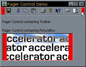
The Pager Control is useful in situations where a window does not have enough area to display a child window. For example, if your application has a toolbar that is not wide enough to show all of its items, you can assign the toolbar to a pager control and users will be able to scroll to the left or right to access all of the items. You can also create pager controls that scroll vertically.
The following illustration shows a toolbar contained in a pager control. The areas coloured in red are the Pager control parts:
How to Use the Pager Control
The Pager Control has been implemented as a control container. In order for the pager to scroll another
control, it must be a child of the Pager Control. You can do this either by drawing the control to be
scrolled into the pager control at design-time, or by setting the child control's Container property
at run-time.
To initialise the pager for the child control, first set the desired orientation with the Orientation
property. Then call the AddChildWindow method with the hWnd of the
control you want to scroll. If the control is a VB toolbar, the buttons will automatically be set to
flat ones.
The control will respond to AddChildWindow with a RequestSize event, during which you should fill in the
width or height (dependent on orientation) in pixels of the child control. If you subsequently change the size
of the child control, call the RecalcSize method, which will again fire the RequestSize event.
Whenever scrolling occurs, the control fires the Scroll event with the amount
it proposes to scroll by in pixels. You can change this amount to your own preferred setting or return
0 to prevent scrolling.
Additional properties let you query the state of the control and set its appearance:
-
AutoHScroll Determines whether the control will automatically scroll during drag-drop operations (DragDrop should be set to true).
-
BackColor Lets you set the back colour of the pager.
-
BorderStyle Sets whether the control has a 3d border or none.
-
ButtonSize Allows you to modify the size of the pager's buttons.
-
ButtonState Returns whether a button is pressed or not.
-
DragDrop Sets whether the control acts as a drag drop target.
-
InternalBorderWidth sets the border between the pager's edges and the control.
Enjoy!
 Back to top Back to top
 Back to Source Code Back to Source Code
|

