vbAccelerator CommandBar Control

The vbAccelerator CommandBar control is a full toolbar/menu control which currently offers configurable styles, colours and a full-object model for configuring the buttons and menus. The control can draw in Office 2003, Office XP, MS Money and System styles, supports icons with alpha-channels and runs on any Windows system. The control is currently a pre-release version, and although it can be used now, some important features have not yet been implemented, particularly MDI support, docking container and toolbar borders.
Object Model
The Command Bar control contains two main collections: the CommandBars collection and the Buttons collection. Once buttons have been added to the Buttons collection, they can be assigned to any CommandBar, and the same button can appear in more than one command bar. Adding drop-down menus to any button is achieved by assigning a CommandBar to the button.
In order to allow multiple controls access to the same buttons and command bars, these collections are global. It is important to note that this means the collections are global to your project, not just to a particular form that the command bar is sited on. This will be most noticable when writing a multiple form project (article describing this coming soon).
The object model for the control is shown diagrammatically below:

vbalCommandBar control object model
Properties, Methods and Events
This section describes the main properties, methods and events of the objects in the CommandBar control. The collection objects are not described as they contain the standard Add, Remove, Count and default Item properties (although note that For..Each enumeration is not supported).
1. Buttons
The behaviour of a button in a control is primarily configured by the button's Style, which is set when the button is added. There are seven styles of buttons provided in the control:
- eNormal - A normal push button. This is the default style.
- eSeparator - A group separator.
- eSplit - A button which shows a split for the drop-down assigned to the button.
- ePanel - A panel which holds a control (for example, a text box or a combo box). When the toolbar is shown in a vertical orientation, the panel is hidden unless the object has a valid icon index, in which case it is displayed as a push button. This follows the operation of style and font pickers in Word.
- eCheck - A checkable button. The check state is independent of any other buttons in the group.
- eRadio - A checkable button that toggles off any other buttons in its group. At least one button in the group must be checked, i.e. clicking a checked radio button means it remains checked.
- eRadioNullable - same as eRadio except that all buttons can be unchecked in a group.
The other properties in the control can be modified at any time:
- Caption - Gets/sets the button's caption text.
- IconIndex - Gets/sets the zero-based index of the icon in an ImageList which will be used to render this button. Set to -1 for no icon.
- ColorBox - When IconIndex is -1, a colour box can be shown instead. Get/set the colour to draw with this property. For no colour box, set the property to CLR_NONE (= -1).
- ToolTip - Gets/sets the tooltip text that will be displayed when the user hovers over the button with the mouse.
- ShortcutKey - Gets/sets the shortcut key to be used to click the button. Use in combination with ShortcutModifiers. Set to 0 if no shortcut key for the button is wanted.
- ShortcutModifiers - Gets/sets the shortcut modifiers (shift key combination) to be used to click the button. Use in combination with ShortcutKey.
- Bar - Gets/sets the cCommandBar that will be shown when the button is clicked (or, if the button's style is eSplit, when the split button is clicked).
- Checked - Gets/sets whether the button is checked or not. Only valid for buttons with the eCheck, eRadio or eRadioNullable styles.
- Enabled - Gets/sets whether the button is enabled or not.
- Locked - similar to enabled, except the button's image and text is not greyed out when Locked = True.
- Visible - Gets/sets whether this button is visible or not.
- ShowCaptionInToolbar - Gets/sets whether the text associated with the button is displayed when the button is associated with a command bar that is being displayed as a Toolbar. By default, toolbars do not display text unless the toolbar is configured as the MainMenu for an application.
- ShowDropDownInToolbar - Gets/sets whether a drop-down arrow is shown next to the button when it is displayed in a toolbar. By default, drop-down arrows are not shown. This property has no effect for eSplit style buttons.
- PanelControl - Gets/sets the control associated with this button. Only valid if the button has the ePanel style.
- PanelWidth - Gets/sets the width for the control associated with this button. Only valid if the button has the ePanel style.
- Key - Gets the key for this button.
- Tag - Gets/sets a string value associated with this button.
- ItemData - Gets/sets a long value associated with this button.
2. Bars
A CommandBar has three properties:
- Title - Gets/sets the name of the command bar. This will be used when the bar is undocked and in customise menus.
- Buttons - Gets the cCommandBarButtons collection of buttons associated with this bar.
- Key - Gets the key for the command bar.
3. The vbalCommandBar Controls
In addition to providing access to the global button and bar collections, the command bar control is also responsible for displaying toolbars and menus on the screen. As VB lacks a simple way to instantiate a new control and have it added to its own container from within a control, command bar controls make requests to their containers for new instances. Since controls which display menus also raise click events, this means it is always best to use command bar controls in a control array.
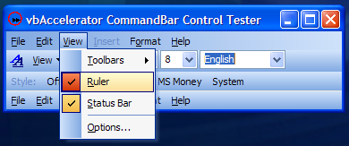
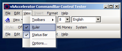
Once the instance(s) of the CommandBar have been created, you can start setting the properties and styles of the command bars to display. There are four style settings which can be used in the control, and in three of the styles all the colours that are used can be customised. Note that styles and colours are global and setting them in one command bar control instance will affect all others. The following images show the different styles of the CommandBar:
-
eOffice2003 Style

Office 2003 Style with XP Visual Styles

Office 2003 Style under Windows Classic
-
eOfficeXP Style

Office XP Style
-
eComCtl32 Style

System Common Controls Style under XP
-
eMoney Style

MS Money Style
Styles are set using the Style property, and the colours used in the style can be customised using the CustomColor, StyleColor and UseStyleColor properties.
Each CommandBar has two Image Lists associated with it (note that these are not currently global properties but probably will be so in the next release), the ToolBarImageList and the MenuImageList. These may be set to point to the same image list if desired. The properties can be set to a Microsoft Windows Common Controls ImageList or any ImageList based on ComCtl32.DLL that exposes a hImageList property.
If the command bar control is to be used as the main menu in the application, set the MainMenu property to True. This configures the control so it will wrap onto a new line when the form is resized, and it also changes the background to the toolbar to the correct style for the menu.
Any toolbar can have a background image, and this image can be Image Processed using the built in image modification properties. The background image can be set using the BackgroundImage property and the hue, luminance or saturation can be modified using AdjustBackgroundImage. There is also a method AdjustImage which can apply the same effects to any picture.
To set the control to show a particular bar, set the Toolbar property. This takes a cCommandBar object, or Nothing to stop the control displaying a bar. The orientation of the toolbar is configured using the Orientation property, and the control can also be Aligned to any side of a form.
To Do List
The following features are due to be implemented for the full release, due at the beginning of March:
- Docking container control and chevrons support.
- MDI Form support (Excel- and Word- style).
- Command bar borders.
- Infrequently-used menu items.
- Shadowing of the highlight around a button when a menu is shown (currently only the menu shadow is shown).
- Menu shadow sometimes renders incorrectly on NT/Win9x/ME systems (it picks up elements of the previous menu that was displayed).
- Menu open animations.
- Configurable sizing mode and button priority.
- Themed combo box drop-down controls.
- Owner-draw buttons.
- Right-aligned buttons.
In the meantime, send any bug reports and I will do my best to fix them.